 Remember the pumpkin that was going outdoors soon....Here is where he ended up. On my back Deck(on a haybale).
Same with the Pumpkin light string.
I needed an extra pumpkin so I ran to my go to Store(Target) and purchase this orange glowy pumpkin. He kinda matched the pumpkin light string. He was the perfect focal point.
I gathered up some leaves from our yard and dumped them on the deck and haybale. Free easy way to decorate for fall scene. I really like this photo with the pumpkins. Might be getting the hang of the new camera. I like that I don't have to do much editing with the new camera(especially when I use NO FLASH). I need to learn all the settings still. There so many options...reading about it would take forever. SO I take so many photos anyway. I think I will just learn by trial and error.
Here are some closeups of more of the fall scene on our back deck. Yes, the scarecrows have moved to the back. I thought instead of throwing them out...why not use them on the back deck. I like them better here. I use to put them up on my front entry but I wanted to make more room.....near the entry. Plus, these scarecrows have seen better days(rotting out). The one lights up(his face). I like my sitting down scarecrow man cuz he can sit and hold things. So I have him sitting on the haybale and holding the pumpkin lights.


The pumpkin fall scene. My favorite part about this scene .....I can see it every time I look out my kitchen window. Love that! We also added the ghost lights hanging down above deck roof. It's hard to tell from this photo...but they blink on and off....for a cool effect.


We bought some new signs for the front too. Target had a sale on these yard signs.....and we got them for 10% the sale price. They didn't have any more in stock...so we took the displays. So they gave us more off on the price. Love that! Plus, we didn't have to assemble them either. LOL! Just a photo of Flash/No flash effect:


I like how they light up so fun and they fit perfect in corners of my rock bed. Speaking of signs.....here is the 2nd sign we bought from Target. I have the one from last year in the porch and it's my blog banner. Maybe this one will show up next year for blog banner??? LOL! I didn't like this sign as much as the porch sign. The font is just so much better on that sign. This one's ok...but it's hard to read until you get pretty close up. It's neat when you do get up close and I do like the bats flying over the moon part. That is really cool! You can kinda see my skull blinky lights on the door glass. We added those this year too. They play a spooky theme from Halloween the movie. They are motion activated! It should give the trick or treaters a thrill when they ring the door bell.
 I redid my entry this year....this sign and skull lights were part of the change. Another change I made...I put my totem pumpkins in my urns this year. I was sick of them on the ground falling over/or trick or treaters kickin' em over. So I decided to paint some old urns black and tie and weight the pumpkins in the urns. I really like how it worked out. Plus, I added some more pumpkins with different lighting(red verse orange light). Not much of a change but enough for a different feel.
 Closeup of the urn and totem pumpkins.........flash/no flash versions:
I don't know what happened to this photo.....LOL! Blurry! I was in a hurry(it was starting to sprinkle outside). Here you can see the whole entry. There a better photo below it without flash....gives more of night effect.


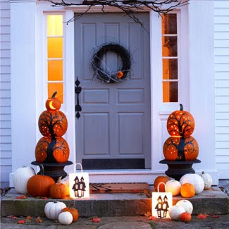
Spooky! The photo below is the inspiration for my black urns and using the totems in urns. In this photo they used real carved pumpkins. I don't do real, cuz they just don't last. My light up pumpkins last every year........I miss real but I do put real ones out(not carved) for fall scene later. I thought it was really cool how they traced trees on the pumpkins and than put little holes like stars shining bright. Cute! I am not the creative so I ran to Target(got light up ones)....Hee hee!
Just some video of Aaron trying out the blinking skull lights:
Inside view of the skull lights and the music.


No comments:
Post a Comment